How to Choose Embroidery for Custom Hoodies and Sweatshirts
An embroidered design can look restrained from a distance or become the main feature of a hoodie. The difference depends on more than thread color. The size of the artwork, its texture, where it sits on the garment, and the fabric underneath it all affect the result.
If you are developing custom hoodies or sweatshirts for your brand, start with the effect you want people to notice. Then choose the embroidery technique that supports that effect.
For a small, clean logo: flat embroidery
Flat embroidery is a practical starting point for a chest logo, a short wordmark, or a small detail on a sleeve. The stitches sit relatively close to the fabric, so the design can be visible without dominating the garment.
Pay particular attention to lettering. A logo that looks clear on a screen may lose definition when reduced to a small embroidered area. Thin lines, narrow gaps, and tiny text should be checked at the actual size intended for the hoodie.
For a minimal collection, consider how the thread color works with the garment color. A tonal logo creates a quieter result; a contrasting color makes the same artwork more noticeable without changing its size.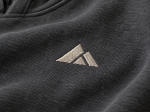
For bold lettering with height: 3D puff embroidery
If raised letters are central to the design, 3D puff embroidery may be a better fit. Stitches cover a foam layer to give the artwork a more pronounced shape.
This effect works best when the important parts of the design are broad enough to remain clear. Very fine lines and closely spaced details can be difficult to reproduce cleanly in a raised finish. A short, bold wordmark is usually a stronger candidate than a detailed illustration.
View the sample from the front and from an angle. Check whether the letter edges look defined, whether the height feels consistent, and whether the finished design still has the proportions you intended.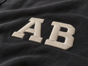
For a soft varsity feel: chenille embroidery
Chenille gives letters and shapes a soft, plush surface. It can make a sweatshirt graphic feel more tactile and is well suited to larger elements that have room to show its texture.
Scale matters here. A large initial on the chest or back gives the texture space to read clearly. If the artwork contains small text or sharp interior corners, consider using another technique for those details rather than forcing the entire design into chenille.
Also look at the garment as a whole. A textured graphic can carry a simple crewneck on its own, while the same graphic may compete with a busy print or several other decorative elements.
For large shapes and material contrast: applique
Applique uses cut fabric pieces attached to the garment with stitching. It lets the graphic introduce a second material, color, or surface texture instead of building every area from embroidery thread.
Imagine a large letter across the chest. The body of the letter could be made from fabric, while the stitching defines its edge. This gives the brand control over both the shape and the contrast against the sweatshirt.
When reviewing an applique sample, look closely at the edges. Check that the shape is positioned correctly, the stitching follows the intended outline, and the added layer sits as you want it to on the garment.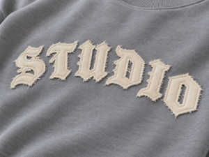
For drawn lines and flowing lettering: chain stitch
Some artwork depends on the character of its lines rather than a filled-in shape. Chain stitch creates a linked line with visible texture, which can suit curved lettering, outlines, and certain illustrative details.
Before choosing it, look at the artwork at garment size. A loose, expressive line may benefit from the stitch texture; a logo that depends on very sharp edges may need a different approach. The sample should preserve the movement of the original drawing without making important details hard to read.
For a light-catching accent: sequin embroidery
Sequin embroidery changes with the light and the viewing angle. On a hoodie or sweatshirt, it can turn a selected part of the artwork into a focal point without covering the entire garment.
Decide which part should catch the eye first. It might be a letter, a small symbol, or one section of a larger graphic. On the sample, check the coverage, the outline of the shape, and how the decoration looks when the garment is laid flat and when it moves.
Because sequins have a distinct surface, it is also sensible to review the garment’s intended use and care requirements before approving the final design.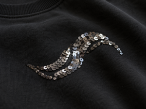
Match the technique to the garment
The artwork is only one part of the decision. A small left-chest logo, a large back graphic, and a design placed near a pocket create different production questions, even when they use the same embroidery technique.
Before sampling, confirm these details together:
- Artwork size: How large should the design be on the finished garment?
- Placement: Where should it sit in relation to the neckline, pocket, seams, and hem?
- Fabric: What material and weight will be used for the hoodie or sweatshirt?
- Color: Should the embroidery blend with the garment or stand apart from it?
- Finish: Will the garment have a wash or another treatment that affects the final appearance?
A photo reference can communicate the direction, but the approved sample should show the result on the chosen garment or a representative fabric. Review it at normal viewing distance, then inspect the edges and texture up close.
Choose the result first
There is no single “best” embroidery for every hoodie. A discreet chest mark, a raised wordmark, and a large varsity graphic ask different things of the material and the stitching.
Start by deciding what the design should look and feel like on the finished garment. Then review the artwork, fabric, placement, and sample together. That gives you a clearer basis for approving the embroidery before bulk production.
Developing custom hoodies or sweatshirts for your brand? Send Yizhe Studio your artwork, garment reference, preferred placement, and target quantity. We can review the details with you as part of sample development and custom production.