6 Printing Options for Custom T-Shirts and Hoodies: How to Choose
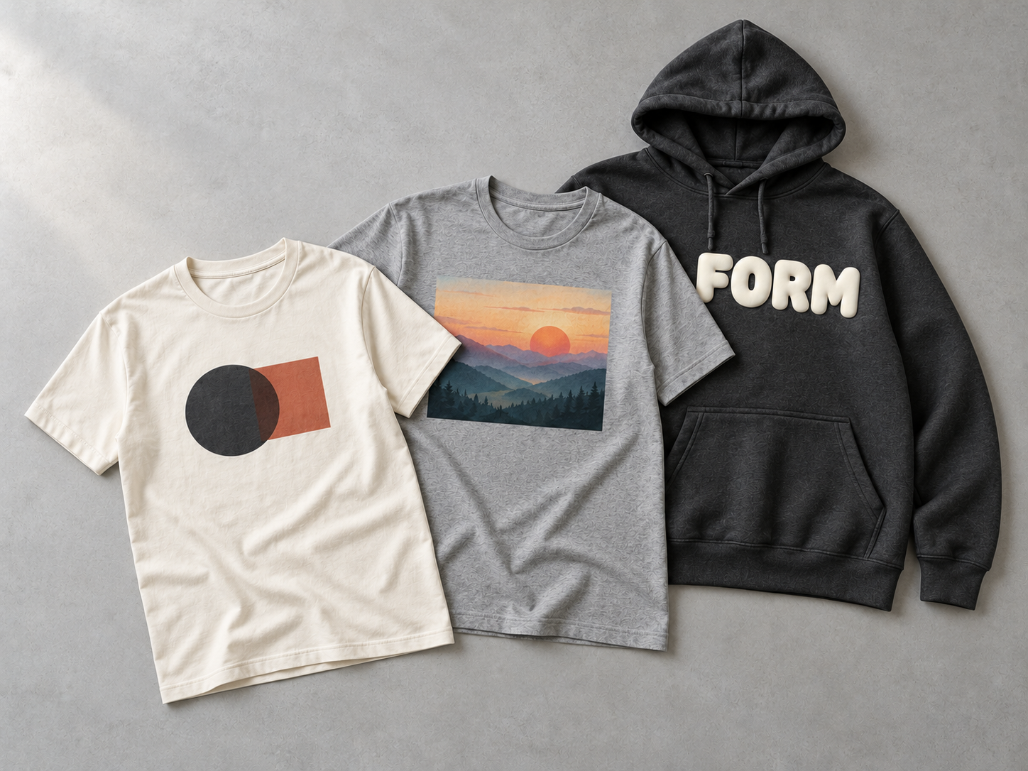
A print method should be chosen for the artwork you want to put on the garment. A bold one-color logo, a photograph and a raised letter design may all look good on the same hoodie mockup, but they need different approaches to produce the intended result.
Before deciding, look at three things: the artwork’s detail, the surface you want customers to feel, and the actual garment fabric. The six options below are a starting point for that discussion. The final result should be checked on a sample before bulk production.
1. Screen Printing: Clear Shapes and Solid Colors
Screen printing is a practical choice for graphics with defined shapes and solid color areas. Think of a large wordmark on a T-shirt or a bold design across the back of a sweatshirt.
Each color needs to be considered as part of the print setup. If your artwork has many small color changes or photographic shading, ask whether screen printing can reproduce the effect as you expect.
On the sample, check the edges, color coverage and position. View the print from normal wearing distance as well as up close: a graphic should work as part of the garment, not only as a close-up photograph.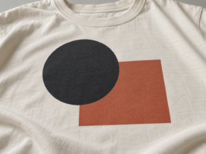
2. DTG Printing: Detailed, Multi-Color Artwork
Direct-to-garment printing, or DTG, applies the design directly to the fabric using a digital process. It can be worth considering for artwork with gradients, many colors or small visual details.
The fabric and garment color matter. A design that looks bright on a white T-shirt may need a different approach on a dark hoodie. Review the print on the fabric and color you actually intend to use.
Check whether the fine details remain visible, whether the colors match your expectations and how the
printed area feels. A digital artwork file cannot answer those questions by itself.
3. DTF Transfers: Detailed Designs Applied With Heat
With DTF, the design is first produced on a film and then transferred onto the garment using heat and pressure. It can reproduce detailed, multi-color graphics, including on garments where you are considering an alternative to direct printing.
DTF is one type of heat transfer, so “DTF” and “heat transfer” are not two separate, opposing categories. Other transfer materials and methods may produce different results.
On the sample, inspect the edges and surface feel. Ask how the transfer works with your chosen fabric, then check the finished garment after an appropriate wash test. A large solid transfer area may feel different from a small logo, even when both use the same method.
4. Puff Printing: A Raised Effect You Can Feel
Puff print expands during curing and creates a visibly raised surface. It works well when height and texture are an intentional part of the design, such as prominent lettering on a streetwear hoodie.
Artwork with tiny lettering or very narrow gaps needs careful review because the raised effect can change how the design reads. Rather than judging puff print from a flat mockup, approve the height, texture and legibility on a physical sample.
The most useful question is not simply “Can this be made puffy?” It is “Which part of this design should stand out?”
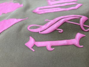
5. Rubber or High-Opacity Paste Printing: Strong Coverage
Rubber or high-opacity paste effects may be considered when a brand wants solid, noticeable color coverage, particularly on a dark garment. The result has a different surface feel from a light print that blends more closely with the fabric.
This option suits artwork where clear color blocks are more important than photographic detail. Discuss the exact finish you want: matte or more pronounced, soft or firm, flat or slightly raised. These descriptions should be confirmed with a sample, since the final hand feel depends on the ink, fabric and print area.
Pay particular attention when a large part of the chest or back is covered. Check how the printed section feels when the garment is worn, not just how bright it looks laid flat.
6. Reflective Printing: An Effect That Changes With Light
A reflective graphic can look restrained in ordinary light and become much more noticeable under direct light. It is useful when that change is part of the design, rather than something added to every logo.
Ask to see the sample in both normal room lighting and direct light. Check the reflective appearance, the color and feel in ordinary lighting, and whether the print placement suits the garment.
Reflective results depend on the selected material or print system. Confirm the effect on your actual fabric instead of assuming every reflective technique will look the same.
How Should Your Brand Narrow Down the Options?
Begin with the artwork, then consider the finished garment:
- Bold, solid graphic: Start by discussing screen printing.
- Photographic image or many color transitions: Assess DTG or a suitable transfer.
- Noticeable raised lettering: Test puff printing.
- Strong, solid coverage on a dark garment: Discuss an appropriate paste print.
- A design that reacts to direct light: Ask to sample a reflective effect.
These are starting points, not fixed rules. Print size, fabric composition, garment color and the quantity you plan to make can change the recommendation. One collection may also use different methods on different styles.
Confirm the Print on a Finished Sample
Before approving bulk production, check the artwork at its final size and position on the intended garment. Look at the surface, edges, color and comfort. If the garment will be washed or finished, review the appearance after the relevant process and test.
At Yizhe Studio, print selection is considered alongside the artwork, fabric and garment design during sample development. Send us your artwork and product requirements to discuss a suitable approach for your custom T-shirts or hoodies.